Tips for a Lasting Color Scheme

With so many wall color options available, it can be hard to decide which one to choose. A beautiful paint color can make a room feel cozy, inviting, and comfortable. But, it can also make the space feel too overwhelming or even odd if you don’t choose the right shade. When choosing the right wall colors for your space, start by considering your existing furnishings, the room’s size, the amount of natural light, and the concept of the room.

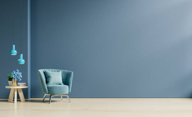
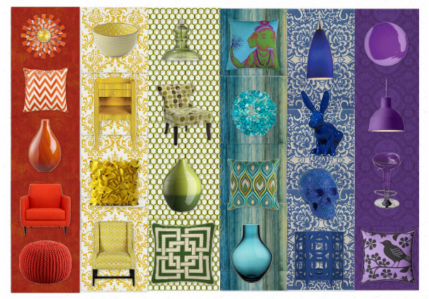
When getting ready to paint a room, it helps to understand the basics of color before you begin. Colors can be classified into three categories: warm colors, cool colors, and neutrals. Warm colors include red, yellow, and orange; cool colors encompass blue, purple, and green; while neutrals include gray, beige, and white. Keep in mind that color combinations of warm and cool colors can result in very beautiful, dynamic, and unique color schemes

Before selecting a paint color, learn about your current furnishings. It’s important to consider the color of your furniture, the floor and carpeting, and other existing objects in the room. Choosing colors that complement each other will create a cohesive and comfortable space. Pay attention to the size of the furniture and the dominant colors in the room. For example, if your furniture and carpets are mostly dark colors, find lighter or brighter colors to balance the palette.

In addition to considering the existing objects in the room, it’s important to think about the size of the room. Smaller rooms will appear more spacious with lighter colors, such as white or cream, while larger rooms can handle heavier tones. Also, take into account how much natural light is available. If a room has plenty of windows, you can use dark colors because the natural light will help brighten up the space. If your room has little natural light, however, avoid dark colors or the room may appear dull and dreary.

Lastly, prioritize the concept of the room and find a color that best reflects it. Do you want an energetic or calming space? Neutral colors, such as beige, are perfect for a cozy atmosphere. For a modern, energizing vibe, use bright colors such as lime green or orange. For an artistic aesthetic, select contrasting colors that will draw attention and provide visual interest.

Choosing the right wall color doesn’t have to be a daunting task. Take your time to consider the existing objects and color concepts in the room, as well as the size and natural light. With a little effort and research, you’ll be sure to find the perfect paint color to reflect your style and create a place you will enjoy being in.

Color & Its Affect On Mood

Have you ever wondered why certain colors have the power to make us feel a certain way? Whether it be bright and cheery yellow walls creating a sense of happiness, or deep greens creating a sense of calm contentment; colors can play a huge role in our emotions and how we interact with our environment.

When it comes to color, the proof is in the pudding; research has shown that certain colors are strong indicators of our moods and how we feel when we are around them. For example, cool colors have been found to create a feeling of calm and peace, while warm colors have been found to create a feeling of energy and enthusiasm. Even the subtle and mysterious shades of purples, blues and greys can be found in many interior designs, bringing a sense of intrigue and stimulating curiosity.

When looking to create a certain atmosphere in our homes, it then becomes important to identify what it is that we are trying to achieve and how color can help this process. For example, if a living or dining room is looking dull and uninspiring, splashes of bright, vibrant colors can add a whole new level of energy and invigoration to the space.

However, the power of color is not only limited to the interior. The use of vibrant colors on the exterior walls of a building or property can also have immense effects on people’s moods. The use of deep reds of fiery oranges can add a pleasant aesthetic to a house; while the use of pastels and light shades can create an air of relaxation and ease.

The interesting thing about colors is that everyone sees them a little differently. Different colors evoke different emotions in people based on their individual backgrounds, experiences and even genetics. Therefore, it’s important to take into account the individual and find colors that fit their lifestyle and tastes.

Due to this, it’s important to do some research and experimentation before committing to a certain color for a room or area. Consult with a color therapist, or even just play around with samples on your own in the space you intend to paint. Also don’t forget to look at the way color can interact with the natural light in the room; as this can completely change the way the paint looks.

Ultimately, the power of color is an incredible and very real thing. Whether its striking cobalt blues, piercing oranges or subtle pinks; colors have the power to make us feel a certain way and can have an immense impact on the way we interact with our environment. Therefore, it’s important to experiment, listen to the advice of color therapists and always take into consideration the individual before choosing our interior or exterior designs.

A Guide To How Wall Color Affects Mood

It’s a well-known fact that specific colors can conjure specific emotions. The colors you choose to surround yourself with will influence the way you feel, from contentment to fear. Wall color is one of the most effective ways to create a space that reflects the mood and atmosphere you want to convey – whether it’s a home, office, or any other indoor space.

It’s no wonder that color therapy has been around for thousands of years. Traditional Chinese medicine uses different colors to balance the body’s ‘chi’ or energy. There’s so much research out there that proves the positive effects that the right colors can have on stress levels, productivity, and general happiness.

But how do you choose the best colors for the walls of your home or office? In this guide, we’ll discuss the different effects that each color can have on your mood in different spaces.

Yellow

The color yellow is often seen as an uplifting, warming, and cheerful color. It works best in a study or another room used for energetic activities, like a games room. In a bedroom, yellow can create an atmosphere that’s peaceful yet somehow energizing.

Pale blue

Blue is a calming color. It induces a sense of relaxation in bedrooms, while it can be used to create a relaxed atmosphere in a living space or office. Pale blues don’t tend to be too overbearing, and can help to maintain a relaxed energy.

Green

Green is associated with nature and is one of the most popular colors for creating a calming atmosphere in the home or office. In addition to helping reduce stress levels, green also enhances concentration.

Purple

Purple is a powerful color. It has been known to promote a sense of creativity and eases mental pressure. It can also be used to add a touch of luxury to any living space, as it’s a color usually associated with sophistication and wealth.

Grey

Grey can be used in any room if you’re looking to create a minimalistic atmosphere. It’s clean-looking and can be combined with other colors that help to bring out its true beauty. It’s a great choice for an office or bedroom if you don’t want any overwhelming bright colors.

Orange

Orange is a combination of yellow – evoking energy – and red – which is associated with passion and love. This makes orange ideal for a bedroom, as it combines both calming and energizing traits. It’s also an excellent choice for a living room or dining area, as it’s known to create a feeling of warmth and comfort.

White

White is often seen as a neutral color that works well in any room. It symbolizes purity, openness, and space. When used in moderation, it can create a fresh clean look in an office, living space, or bedroom.

Black

Black is a rather intense color. While it’s associated with power and authority, it can also be used for a negative mood, like that of a moody teenager’s bedroom.

Brown

Brown evokes a feeling of nature and embraces coziness. It’s an excellent choice for a study, study area, or den.

Conclusion

Overall, different colors can evoke different emotions, depending on the room and the atmosphere you want to create. Make sure that the colors you choose suit the purpose of the room, and they will, in turn, influence your mood. The right colors can help to reduce stress, increase productivity and even boost your general happiness.

How Colors of Your Walls helps your mood

It’s no secret that the color of your walls has a big impact on your emotions. While some colors evoke a feeling of calm, others can bring a feeling of energy and motivation. It’s an important factor to keep in mind when you’re designing the spaces of your home. Here’s a look at how colors of your walls can help your mood.

The color blue, for example, is known to be very calming. It’s especially popular in bedrooms due to its ability to help you relax and get a good night’s sleep. Blue is also believed to help with depression and anxiety, which can be an issue for many people. The color is said to invoke a feeling of peace, even during difficult times.

Yellow is a vibrant color that can bring a lot of energy to a room. It’s often seen as an uplifting color, helping to lift your spirits when you’re feeling down. The color yellow is also believed to help with children’s concentration levels; it’s sometimes used in classrooms to help keep kids focused during lessons.

Green is a very soothing color and is often used in spa-like environments. The hue brings a feeling of tranquility and serenity to a space, helping you to unwind after a stressful day. Green is a popular choice for bedrooms and bathrooms because of its ability to aid relaxation and sleep.

Orange is a vibrant color that can help bring optimism and enthusiasm to a room. It’s great for living rooms or kitchens, as the hue helps to stimulate conversation and boost creativity. This color is also known to increase energy levels, which can help improve productivity.

Purple is often seen as a calming color due to its sedative properties. This hue can help reduce tension and stress, allowing your mind and body to relax. It’s great for bedrooms as it helps promote a good night’s rest.

White is often seen as a neutral color but it can actually have positive effects on your mood. The hue is known to evoke a feeling of freshness and clarity, which can help to boost your focus and productivity. It’s a great choice for living areas, as it can make a room look bigger and brighter.

No matter what colors you choose to paint the walls of your home with, they’ll surely have an impact on your mood. Different colors evoke different types of feelings so it’s important to choose the hue that fits your needs and lifestyle. Whether you’re looking for energy and creativity or relaxation and serenity, the colors of your walls can always help to improve your mood.

Colors of Your Walls Can Affect Your Mood

Have you ever noticed how colors can affect your mood? While the color of your walls may seem like a minor detail, studies have proven that it can significantly affect our mental state, concentration, and energy levels. Not only can it influence our feelings, but it can also affect behavior and decision-making. It’s important to be aware of the psychological effects of color when deciding on a color for your walls.

First of all, it’s important to understand the basics of color psychology. While the exact definition of color psychology is still open to debate, it explains how colors can have a psychological, emotional, and physical effect on us. Many of these effects are instinctual and subconscious, so it’s important to pay attention to which colours we’re drawn towards. Different colors evoke different feelings, so you’ll want to choose a color that evokes the feeling you’re looking for in your space.

For a space that is meant to be tranquil and calming, for example, opt for blues or greens. Blues can be very calming and promote feelings of tranquility, while greens can evoke a sense of peace. A sunny yellow, on the other hand, can help energize and motivate. If you’re looking to create a feeling of luxury and opulence, gold or bronze could work.

Aside from emotions, color can have a physical effect on us as well. Bright colors can help energize and invigorate us, while softer shades can help us relax and unwind. Darker shades can reduce the amount of light in the room, making it more conducive to sleeping and rest. Color can also help set the tone for the room, whether it’s a colorful room meant for play or a peaceful blue room designed for rest.

After choosing the right color for your walls, you’ll also want to consider color combinations. To create a harmonious and balanced feel, it’s best to choose colors that complement, rather than clash, with each other. Utilizing contrasting colors or shades can help create a dynamic and exciting feeling. If you’re unsure of how to combine colors, there are plenty of resources available online that can help you create the perfect combination.

Lastly, it’s important to remember that color can also have cultural implications. Different cultures have different associations with colors, so you’ll want to be mindful of these connotations when choosing a color for your walls. For example, in some countries blue could be seen as cold or distant, while red could signify energy and passion. It’s best to research the cultural implications of your chosen color before committing to it.

At the end of the day, the colors you choose for your walls can significantly affect your mood and behavior. With a little bit of research and consideration, you can ensure that your walls evoke the emotions that you’re looking for.

The Science of Color and Its Effect on Our Lives

The science of colorology is a fascinating exploration of how different colors have an effect on our bodies, minds, and emotions. It is a field of study that investigates how color can be used to enhance physical, spiritual, and mental health. For example, certain colors can be used to help people relax, or energize them for a workout. It can also be used to stimulate creativity or to brighten a person’s mood.

Color is everywhere and affects our lives in numerous ways. Bright colors draw out feelings of joy, while duller colors can promote feelings of sadness and depression. A room painted in pale blue, for example, may be tranquil and calming and could be the perfect place to relax, while a brightly-colored room may be seen as being stimulating and energetic.

The color theory was first developed by Johann Wolfgang von Goethe in the late 18th century and it still provides a basis for color theory today. Many experts use this theory to better understand the psychology and physiology behind color. This is because we respond to certain colors in subconscious ways.


Colors are also associated with certain emotions and this is one of the key tenets of colorology. Different colors evoke different emotional responses, such as joy, peace, anxiety, and anger. A room painted in blue, for example, might be calming, whereas a yellow room might give off an optimistic and cheerful feeling. By understanding the different psychological effects of color, individuals can learn how to manipulate their behaviors and emotions by surrounding themselves with certain hues.

Colorology’s also look at the effects of color on the body and its systems. Studies have shown that warm colors, such as orange, red, and yellow, can stimulate energy and emotions. Cool colors, on the other hand, like green and blue, can evoke feelings of serenity and relaxation. For example, red might be the perfect color to boost alertness and creativity, while blue can promote a sense of calming tranquility.

One final aspect of colorology is its influence on our spiritual lives. Many cultures around the world assign certain colors to specific meanings. For instance, in China, the color red is associated with prosperity and success, while in Japan, white is often a symbol of purity. Color can also symbolize something spiritual, like blue being the color of wisdom and faith. By understanding the deeper meanings of certain colors, we can use them to uplift our spirits.

In conclusion, the science of colorology is a fascinating field that is rapidly gaining momentum. It looks at the relationship between different colors and how they affect our physical, mental, emotional, and spiritual well-being. With more research, colorology’s are certain to unlock the secrets of how hues can be used to enhance our lives.

Color Schemes Help Mental Problems

mental health color schemesA little known aid for treating mental problems, such as anxiety or depression, is with colors. The emerging study of color psychology indicates that the color schemes we are surrounded by in our day-to-day lives have a profound impact on our moods and mentalities. Below are color scheme remedies to some of the most common mental problems.

  • Anger. The most effective color schemes for anger are lavender, yellow and green. The lavender helps bring down anger levels with its soothing, calming effects, helping the angry person to transition into a more peaceful state. The yellow promotes positivity which works to bring the individual into a better state of mind. And the green brings the person’s mood back into balance instead of remaining overwhelmingly agitated.
  • Anxiety. The most effective color schemes for anxiety are, like anger, lavender, yellow and green. Anxiety is a high adrenaline state, like anger, so the soothing effects of lavender are necessary for quelling the individual’s fear and rampant thoughts. Yellow changes the course of their thinking from negative to positive, while green helps the individual center themselves and use logic.
  • Depression. The most effective color schemes for depression are blue, yellow and green. Blue is a color that is commonly associated with depression, so it may come as a surprise that it is recommended for someone with depression. Despite its associations, the strongest studied effect of blue on a person’s psychology is productivity. One of the most noted effects of depression is being unproductive, so the color blue is vitally important to a depressed person. Yellow promotes energy and positivity, another few things that a depressed person is lacking, and green of course promotes balance, which is missing from any mental disorder.
  • ADHD. The most effective color schemes for ADHD are lavender, blue and green. Lavender is calming, which is the most important therapeutic component someone with ADHD can receive. Blue helps them become collected enough to organize and plan, while green balances their high energy with calmness and meditation.

Color and Mood Associations

  • colorful mood enhancementBlue for productivity. Blue is a color that, in Western culture, we often associate with sadness or mysticism. This is our subjective take on it, as blue can represent royalty or power in other parts of the world. This may come as a surprise, but color psychologists have learned through studies that the most universal effect that the color blue has on people is productivity. Psychologists believe this is because blue is associated with calmness, thoughtfulness and organization, and influences those observing it to introspect. Other color psychologists observe that the blue of the sky and of water is overwhelmingly the most blue that humans take in, and its representation of wide open spaces puts distractions out of mind.
  • Green for balance. Green is most commonly associated with nature because a majority of plant life on earth is green. Humans take in green largely through nature, so we associate green with natural living and surroundings. Not surprisingly, green has a balancing effect on our psychology. It is fitting that all Western labels that represent organic products or natural living are in green, and catch phrases like “go green” means making an effort to make life practices more sustainable, which is essentially another term for balanced.
  • Lavender for calm. This one likely does not come as a surprise either. The things that occur in nature that are lavender are predominately calm times of day and plant life, particularly flora. Purple plant life is largely associated with flowers and herbs, which have therapeutic benefits. The sky is also purple at dawn and at dusk, which are times of day that are associated with serenity.
  • Yellow for energy. Again drawing on nature associations, the sun is obviously the most universal source of yellow that people the globe over observe. The sun is, of course, pure energy, so it is entirely logical that we would associate yellow with energy. The psychological effects of being surrounded by the color yellow are that of invigoration and stimulation.

Mood Enhancement Through Color

colors and moodMany people have long associated different colors with moods. This is why we see so much red around Valentine’s Day – because red is the color associated with love, romance and passion. And when someone is feeling down, we commonly say they are feeling blue, because blue is associated with a subdued state of mind. These color associations are deeply ingrained within our culture, but something that many people do not know is that experts have studied the effects of different colors on people’s moods and have created official studies stating which colors are associated with which moods. They are not absolute, but rather represent the most common correlations between color and mood. Some strongly resemble the correlations that people have made culturally while others may surprise people.

There is still a long way for color psychology to come, but what we know for certain is that ranges of colors have a particular range of effects on their human observer, and that these effects can be subjective in nature. In Western culture, white often symbolizes purity and virtue, but in many Eastern cultures, it represents mourning. The most absolute way of understanding color psychology is generalizing certain ranges of colors. Red, orange and yellow are associated with stimulation, ranging from happiness to tension. Blue, purple and green are associated with depressive qualities, ranging from calm to sadness.

You can see color psychology used in interior decorating, marketing and any design related fields. Professions that involve selling have long made use of color psychology to influence their client’s moods and decisions. The more you learn about color psychology and how it relates to moods, the more you can begin to apply this information to your personal space and possessions. Many people have applied this information to the personal decorating scheme in their home, office and even their vehicles. It is a valuable tool considering it can influence you towards energy, calmness clarity and happiness.

Home Decor for Mental Health

colors and moodThe way we design our homes does a lot more than simply say something about us. It also effects us at a subconscious level. The colors we use in our decor schemes have the potential to alter our moods when we take them in. Most people choose colors for their homes on the basis of which colors they like or have seen in a magazine, however, giving thought to the way color schemes effect your mood and disposition can be very important to your day to day mental health, and can alter your state of being for better or worse. Here is a list of decor colors, what affect they have on people and how to utilize them best.

  • Blue: the color blue is commonly associated with feelings of sadness when in fact, surroundings that are blue in color have the effect of making a person more productive. Blue is at the calming end of the color spectrum and promotes focus and organization. This is a great color to utilize in your home if you battle laziness and lethargy.
  • Green: the color green in commonly associated with natural living, but at a subconscious psychological level, green has a balancing effect on the people it surrounds. This promotes general health in one’s lifestyle and good decision making. Utilizing the color green in your home decor is recommended if you grapple with any mental instability or hardship, ranging from serious ailments such as depression and addiction tendencies to minor ailments such as disorganization.
  • Lavender: the color lavender is sometimes thought of as a feminine color, but its true mental association is one of calm. The color lavender statistically has a calming effect on the people it surrounds, which is very beneficial if a person is prone to stress or diagnosed with an anxiety or attention deficit disorder.
  • Yellow: the color yellow is often associated with happiness because of its bright appearance, and its studied effect on a person is similar in nature. Yellow surroundings promote energy, making it a great decorating choice for people who have trouble jumping into new things, or for people who battle depression and other energy zapping conditions.